Design Examples
To create a landscape that you will love, incorporating things you love is very important.
It is usually helpful to see specific examples of both good and bad design. Pay attention when you are out strolling to elements that you find pleasing. But also try to figure out why it appeals to you. Is it the colors? plants? design? Here a few pictures to get you started, with a little explanation about the principles applied.
Balance
The dominant design principle here is balance. Although balance is often associated with a formal landscape, the balance here is not achieved with perfect symmetry, but rather with objects of similar physical size or visual “weight”. The visual balance here lends some formality to the front of the property, but is still casual and inviting, and well suited to the style of the home. Note that the entrance is visually open and visitors are drawn by the red door.
Out of Balance
The dominant design principle here is balance. Although balance is often associated with a formal landscape, the balance here is not achieved with perfect symmetry, but rather with objects of similar physical size or visual “weight”. The visual balance here lends some formality to the front of the property, but is still casual and inviting, and well suited to the style of the home. Note that the entrance is visually open and visitors are drawn by the red door.
Asymmetrical Balance
Balance here is very formal but not symmetrical. The landscaping is very simple and neatly pruned to combat what looks like a pretty “busy” surrounding of trees and slopes. The home itself is also interesting enough with lots mullioned and shuttered windows and brick facade - the very simple landscaping does not compete with all that. The tall evergreen past the sidewalk is perfectly placed. Without it there would be a feeling of dropping off, and the evergreen stops the eye from wandering past the entry area.
Elements Unified
This tropical garden will hardly be found in the midwest, but is so beautifully displays important design elements it had to be included here. First, seemingly unrelated plant and accent pieces are unified with a very simple low border hedge. Then, the elements are joined by flowing stepping stones, leading you along to appreciate each and every accent. The path and the border plantings are flowing curves, the accents punctuated by the angular hedge.
Inviting Room
This one is just plain gorgeous, wouldn’t you love to be relaxing with a book on this patio? It might be a bit busy to suit everyone, but it accomplished some very difficult things. First, the large plantings have provided a lot of privacy for this back patio. Rather than hiding and overwhelming the space, anyone entering the backyard is clearly drawn to a cozy “room”. The planting beds create a flowing path of lawn drawing visitors into the “room”. The planting beds are full and lush, helping to balance the foundation with the large evergreens. Nicely done!
Repeated Geometrics
Rectangles are nicely repeated through this backyard landscape, lending a somewhat formal appearance. Areas are joined by pathways and linear elements, separation of the geometric areas softened with plants. The living “curve” in the center island is a wonderful accent, very clever!
Repetition of Circles
A pleasing combination of curves and angles, the theme of circles is repeated with paver edging and in plant shapes. The circles are balanced with the rectangular shape of the screens and accented with spiky plants
Repetition & Simplicity
Good balance of circular and angular shapes. Repetition is achieved with circle shapes in both the stepping stones and the plant shapes. Simplicity is achieved with the repetition white plants. Unity is achieved with the mulch base used throughout the entire planting area.
Repetition Overdone
Repetition is overdone. There is no relief from circle shapes. Lacks simplicity and quiet space for the eye to rest.
Garden Room
This lovely garden room has no walls but is clearly set apart from the lawn with large pavers. Installing the pavers with lawn separating them anchors the “room” solidly to the landscape, but also unifies it with the home structure and the lawn
Traffic Flow
These broken paver slabs seem so simple but accomplish so much. They create traffic flow; separate landscape areas but also join the areas because they ARE broken, allowing the lawn to mingle in; they create repetition; and they create interest that simple edging would not.
Corner Trap
This is a trap a lot of homeowners fall into - planting in a strip on the property perimeter. It lacks interest and is not unified with other elements.
Color, Variety, Unity
This wonderful mixed border is so interesting. Primarily green plants are used to unify the bed in varying textures. It seems very colorful, but in reality only a couple of colors are used. Blue is repeated throughout the planting, as is red in varying shades. There is a very large variety of plants used, but only in three dominant colors.
Color & Texture
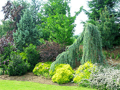
A border of only shrubs and evergreens can be just as colorful and interesting. Nearly every plant in this border is an evergreen, but each plant variety used has unique coloring and texture. There are at least seven or eight very different greens as well as deciduous shrubs of gray green and purple burgundy. Groupings of 3 to 5 small plants helps to balance with the single large ones.
Transition
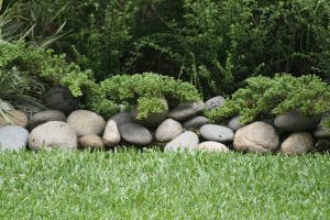
For a large property surrounded by wooded area, this boulder wall is a great way to transition from lawn to woods. The creeping evergreens spilling over the boulders eases the transition from rock to trees.
Unified
This little entry garden has an awful lot going on, but there a few things that keep it from looking too busy. Three plants of completely different color and texture are the same size and the same shape, unifying them. Small boulders scattered with the underplantings are the same size and color of the dusty miller likewise scattered. A consistent red color is repeated throughout.
Lacks Unity
A very interesting mix of plants completely lacks unity and repetition. The solution could be as simple as using the same base of either mulch OR stones throughout the planting bed. Then select just one of the plants to repeat throughout. The orange lily would be ideal because of its’ color and spiky foliage, but the bloom does not last and the foliage deteriorates after flowering. Groupings of 3 or 5 of the same orange that flower at different times through the season might be nice.
Repetition balances Variety
A great variety of plants is unified by repetition of ornamental grass and hydrangea.
Contrast of Style
Look carefully at this photo to discover the very interesting composition of plants. In the background is a meticulously pruned and sculpted hedge. The mid range is almost cottage garden style with masses of loosely growing perennials. Front and center is a spiky ornamental grass. This landscape does not follow many rules, the severe contrast of style makes it work. Striking!
Color Theme
Blue and white gardens have always been popular, but very difficult to do. This one is exceptionally well done, with true blue blooms used all through the front landscape. The ‘black” bicolor accent plant at the entrance to the sidewalk is perfect paired with the black urn. Clearly announces “this is where you enter”.
Simple Theme
A simple theme makes anything work together. This one is all, and only, spiked flowerheads! Nice!
Transition
Creating a transition between lawn and woodland is always a challenge. A narrow strip will not keep the native undergrowth from creeping to the lawn and does not give enough room to use large scale plants to balance the transition between lawn and large trees. So give yourself plenty of room. This example is well balanced and full of color, texture, repetition and variety.


